python数据分析绘图_python 协方差图-程序员宅基地
ROC-AUC曲线(分类模型)
混淆矩阵
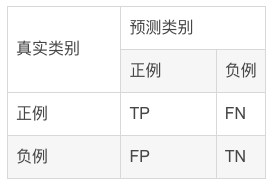
混淆矩阵中所包含的信息
- True negative(TN),称为真阴率,表明实际是负样本预测成负样本的样本数(预测是负样本,预测对了)
- False positive(FP),称为假阳率,表明实际是负样本预测成正样本的样本数(预测是正样本,预测错了)
- False negative(FN),称为假阴率,表明实际是正样本预测成负样本的样本数(预测是负样本,预测错了)
- True positive(TP),称为真阳率,表明实际是正样本预测成正样本的样本数(预测是正样本,预测对了)
ROC曲线示例
可以看到,ROC曲线的纵坐标为真阳率true positive rate(TPR)(也就是recall),横坐标为假阳率false positive rate(FPR)。
TPR即真实正例中对的比例,FPR即真实负例中的错的比例。
- 真正类率(True Postive Rate)TPR:
TPR=TP/(TP+FN)
代表分类器 预测为正类中实际为正实例占所有正实例 的比例。 - 假正类率(False Postive Rate)FPR:
FPR=FP/(FP+TN)
代表分类器 预测为正类中实际为负实例 占 所有负实例 的比例。
可以看到,右上角的阈值最小,对应坐标点(1,1);左下角阈值最大,对应坐标点为(0,0)。从右上角到左下角,随着阈值的逐渐减小,越来越多的实例被划分为正类,但是这些正类中同样也掺杂着真正的负实例,即TPR和FPR会同时增大。
- 横轴FPR: FPR越大,预测正类中实际负类越多。
- 纵轴TPR:TPR越大,预测正类中实际正类越多。
- 理想目标:TPR=1,FPR=0,即图中(0,1)点,此时ROC曲线越靠拢(0,1)点,越偏离45度对角线越好。
AUC值是什么?
AUC(Area Under Curve)被定义为ROC曲线下与坐标轴围成的面积,显然这个面积的数值不会大于1。又由于ROC曲线一般都处于y=x这条直线的上方,所以AUC的取值范围在0.5和1之间。
- AUC越接近1.0,检测方法真实性越高;
- 等于0.5时,则真实性最低,无应用价值。

ROC曲线绘制的代码实现
#导入库
from sklearn.metrics import confusion_matrix,accuracy_score,f1_score,roc_auc_score,recall_score,precision_score,roc_curve
import matplotlib.pyplot as plt
from sklearn.metrics import roc_curve, auc
import matplotlib.pyplot as plt

#绘制roc曲线
def calculate_auc(y_test, pred):
    print("auc:",roc_auc_score(y_test, pred))
    fpr, tpr, thersholds = roc_curve(y_test, pred)
    roc_auc = auc(fpr, tpr)
    plt.plot(fpr, tpr, 'k-', label='ROC (area = {0:.2f})'.format(roc_auc),color='blue', lw=2)
    plt.xlim([-0.05, 1.05])
    plt.ylim([-0.05, 1.05])
    plt.xlabel('False Positive Rate')
    plt.ylabel('True Positive Rate')
    plt.title('ROC Curve')
    plt.legend(loc="lower right")
    plt.plot([0, 1], [0, 1], 'k--')
    plt.show()
相关性热图
表示数据之间的相互依赖关系。但需要注意,数据具有相关性不一定意味着具有因果关系。
相关系数(Pearson)
相关系数是研究变量之间线性相关程度的指标,而相关关系是一种非确定性的关系,数据具有相关性不能推出有因果关系。相关系数的计算公式如下:

其中,公式的分子为X,Y两个变量的协方差,Var(X)和Var(Y)分别是这两个变量的方差。当X,Y的相关程度最高时,即X,Y趋近相同时,很容易发现分子和分母相同,即r=1。
代码实现
相关性计算
import numpy as np
import pandas as pd
# compute correlations
from scipy.stats import spearmanr, pearsonr
from scipy.spatial.distance import cdist

def calc_spearman(df1, df2):
	df1 = pd.DataFrame(df1)
	df2 = pd.DataFrame(df2)
    n1 = df1.shape[1]
    n2 = df2.shape[1]
    corr0, pval0 = spearmanr(df1.values, df2.values)
    # (n1 + n2) x (n1 + n2)
    corr = pd.DataFrame(corr0[:n1, -n2:], index=df1.columns, columns=df2.columns)
    pval = pd.DataFrame(pval0[:n1, -n2:], index=df1.columns, columns=df2.columns)
    return corr, pval

def calc_pearson(df1, df2):
	df1 = pd.DataFrame(df1)
	df2 = pd.DataFrame(df2)
    n1 = df1.shape[1]
    n2 = df2.shape[1]
    corr0, pval0 = np.zeros((n1, n2)), np.zeros((n1, n2))
    for row in range(n1):
        for col in range(n2):
            _corr, _p = pearsonr(df1.values[:, row], df2.values[:, col])
            corr0[row, col] = _corr
            pval0[row, col] = _p
    # n1 x n2
    corr = pd.DataFrame(corr0, index=df1.columns, columns=df2.columns)
    pval = pd.DataFrame(pval0, index=df1.columns, columns=df2.columns)
    return corr, pval
画出相关性图
import matplotlib.pyplot as plt
import seaborn as sns

def pvalue_marker(pval, corr=None, only_pos=False):
    if only_pos:  # 只标记正相关
        if corr is None:
            print('correlations `corr` is not provided, '
                  'negative correlations cannot be filtered!')
        else:
            pval = pval + (corr < 0).astype(float)
    pval_marker = pval.applymap(lambda x: '**' if x < 0.01 else ('*' if x < 0.05 else ''))
    return pval_marker

def plot_heatmap(
    mat, cmap='RdBu_r',
    xlabel=f'column', ylabel=f'row',
    tt='',
    fp=None,
    **kwds
):
    fig, ax = plt.subplots()
    sns.heatmap(mat, ax=ax, cmap=cmap, cbar_kws={
    'shrink': 0.5}, **kwds)
    ax.set_title(tt)
    ax.set_xlabel(xlabel)
    ax.set_ylabel(ylabel)
    if fp is not None:
        ax.figure.savefig(fp, bbox_inches='tight')
    return ax
实例
#构造有一定相关性的随机矩阵
df1 = pd.DataFrame(np.random.randn(40, 9))
df2 = df1.iloc[:, :-1] + df1.iloc[:, 1: ].values * 0.6
df2 += 0.2 * np.random.randn(*df2.shape)
#绘图
corr, pval = calc_pearson(df1, df2)
pval_marker = pvalue_marker(pval, corr, only_pos=only_pos)
tt = 'Spearman correlations'
plot_heatmap(
    corr, xlabel='df2', ylabel='df1',
    tt=tt, cmap='RdBu_r', #vmax=0.75, vmin=-0.1,
    annot=pval_marker, fmt='s',
)

only_pos 这个参数为 False 时, 会同时标记显著的正相关和负相关.
cmap属性调整颜色可选参数:
‘Accent’, ‘Accent_r’, ‘Blues’, ‘Blues_r’, ‘BrBG’, ‘BrBG_r’, ‘BuGn’, ‘BuGn_r’, ‘BuPu’, ‘BuPu_r’, ‘CMRmap’,‘CMRmap_r’, ‘Dark2’, ‘Dark2_r’, ‘GnBu’, ‘GnBu_r’, ‘Greens’, ‘Greens_r’, ‘Greys’, ‘Greys_r’, ‘OrRd’, ‘OrRd_r’, ‘Oranges’, ‘Oranges_r’, ‘PRGn’, ‘PRGn_r’, ‘Paired’, ‘Paired_r’, ‘Pastel1’, ‘Pastel1_r’, ‘Pastel2’, ‘Pastel2_r’, ‘PiYG’, ‘PiYG_r’, ‘PuBu’, ‘PuBuGn’, ‘PuBuGn_r’, ‘PuBu_r’, ‘PuOr’, ‘PuOr_r’, ‘PuRd’, ‘PuRd_r’, ‘Purples’, ‘Purples_r’, ‘RdBu’, ‘RdBu_r’, ‘RdGy’, ‘RdGy_r’, ‘RdPu’, ‘RdPu_r’, ‘RdYlBu’, ‘RdYlBu_r’, ‘RdYlGn’, ‘RdYlGn_r’, ‘Reds’, ‘Reds_r’, ‘Set1’, ‘Set1_r’, ‘Set2’, ‘Set2_r’, ‘Set3’, ‘Set3_r’, ‘Spectral’, ‘Spectral_r’, ‘Wistia’, ‘Wistia_r’, ‘YlGn’, ‘YlGnBu’, ‘YlGnBu_r’, ‘YlGn_r’, ‘YlOrBr’, ‘YlOrBr_r’, ‘YlOrRd’, ‘YlOrRd_r’, ‘afmhot’, ‘afmhot_r’, ‘autumn’, ‘autumn_r’, ‘binary’, ‘binary_r’,‘bone’, ‘bone_r’, ‘brg’, ‘brg_r’, ‘bwr’, ‘bwr_r’, ‘cividis’, ‘cividis_r’, ‘cool’, ‘cool_r’, ‘coolwarm’, ‘coolwarm_r’, ‘copper’, ‘copper_r’, ‘crest’, ‘crest_r’, ‘cubehelix’, ‘cubehelix_r’, ‘flag’, ‘flag_r’, ‘flare’, ‘flare_r’, ‘gist_earth’, ‘gist_earth_r’, ‘gist_gray’, ‘gist_gray_r’, ‘gist_heat’, ‘gist_heat_r’, ‘gist_ncar’, ‘gist_ncar_r’, ‘gist_rainbow’, ‘gist_rainbow_r’, ‘gist_stern’, ‘gist_stern_r’, ‘gist_yarg’, ‘gist_yarg_r’, ‘gnuplot’, ‘gnuplot2’, ‘gnuplot2_r’, ‘gnuplot_r’, ‘gray’, ‘gray_r’, ‘hot’, ‘hot_r’, ‘hsv’, ‘hsv_r’,‘plasma’, ‘plasma_r’, ‘prism’, ‘prism_r’, ‘rainbow’, ‘rainbow_r’, ‘rocket’, ‘rocket_r’, ‘seismic’, ‘seismic_r’, ‘spring’, ‘spring_r’, ‘summer’, ‘summer_r’, ‘tab10’, ‘tab10_r’, ‘tab20’, ‘tab20_r’, ‘tab20b’, ‘tab20b_r’, ‘tab20c’, ‘tab20c_r’, ‘terrain’, ‘terrain_r’, ‘turbo’, ‘turbo_r’, ‘twilight’, ‘twilight_r’, ‘twilight_shifted’, ‘twilight_shifted_r’, ‘viridis’, ‘viridis_r’, ‘vlag’, ‘vlag_r’, ‘winter’, ‘winter_r’
棒棒糖图
条形图在数据可视化里,是一个经常被使用到的图表。虽然很好用,也还是存在着缺陷呢。比如条形图条目太多时,会显得臃肿,不够直观。
棒棒糖图表则是对条形图的改进,以一种小清新的设计,清晰明了表达了我们的数据。
代码实现
# 导包
import matplotlib.pyplot as plt
import numpy as np
import pandas as pd

# 创建数据
x=range(1,41)
values=np.random.uniform(size=40)
# 绘制
plt.stem(x, values)
plt.ylim(0, 1.2)
plt.show()

# stem function: If x is not provided, a sequence of numbers is created by python:
plt.stem(values)
plt.show()

# Create a dataframe
df = pd.DataFrame({
    'group':list(map(chr, range(65, 85))), 'values':np.random.uniform(size=20) })

# Reorder it based on the values:
ordered_df = df.sort_values(by='values')
my_range=range(1,len(df.index)+1)
ordered_df.head()
# Make the plot
plt.stem(ordered_df['values'])
plt.xticks( my_range, ordered_df['group'])
plt.show()

# Horizontal version
plt.hlines(y=my_range, xmin=0, xmax=ordered_df['values'], color='skyblue')
plt.plot(ordered_df['values'], my_range, "D")

plt.yticks(my_range, ordered_df['group'])
plt.show()

# change color and shape and size and edges
(markers, stemlines, baseline) = plt.stem(values)
plt.setp(markers, marker='D', markersize=10, markeredgecolor="orange", markeredgewidth=2)
plt.show()

# custom the stem lines
(markers, stemlines, baseline) = plt.stem(values)
plt.setp(stemlines, linestyle="-", color="olive", linewidth=0.5 )
plt.show()

# Create a dataframe
value1=np.random.uniform(size=20)
value2=value1+np.random.uniform(size=20)/4
df = pd.DataFrame({
    'group':list(map(chr, range(65, 85))), 'value1':value1 , 'value2':value2 })

# Reorder it following the values of the first value:
ordered_df = df.sort_values(by='value1')
my_range=range(1,len(df.index)+1)
# The horizontal plot is made using the hline function
plt.hlines(y=my_range, xmin=ordered_df['value1'], xmax=ordered_df['value2'], color='grey', alpha=0.4)
plt.scatter(ordered_df['value1'], my_range, color='skyblue', alpha=1, label='value1')
plt.scatter(ordered_df['value2'], my_range, color='green', alpha=0.4 , label='value2')
plt.legend()

# Add title and axis names
plt.yticks(my_range, ordered_df['group'])
plt.title("Comparison of the value 1 and the value 2", loc='left')
plt.xlabel('Value of the variables')
plt.ylabel('Group')

# Show the graph
plt.show()

# Data
x = np.linspace(0, 2*np.pi, 100)
y = np.sin(x) + np.random.uniform(size=len(x)) - 0.2

# Create a color if the y axis value is equal or greater than 0
my_color = np.where(y>=0, 'orange', 'skyblue')
# The vertical plot is made using the vline function
plt.vlines(x=x, ymin=0, ymax=y, color=my_color, alpha=0.4)
plt.scatter(x, y, color=my_color, s=1, alpha=1)

# Add title and axis names
plt.title("Evolution of the value of ...", loc='left')
plt.xlabel('Value of the variable')
plt.ylabel('Group')

# Show the graph
plt.show()

火山图
火山图(Volcano plots)是散点图的一种,根据变化幅度(FC,Fold Change)和变化幅度的显著性(P value)进行绘制,其中标准化后的FC值作为横坐标,P值作为纵坐标,可直观的反应高变的数据点,常用于基因组学分析(转录组学、代谢组学等)。
绘制
制作差异分析结果数据框
genearray = np.asarray(pvalue)

result = pd.DataFrame({
    'pvalue':genearray,'FoldChange':fold})

result['log(pvalue)'] = -np.log10(result['pvalue'])
制作火山图的准备工作
result['sig'] = 'normal'

result['size']  =np.abs(result['FoldChange'])/10

result.loc[(result.FoldChange> 1 )&(result.pvalue < 0.05),'sig'] = 'up'
result.loc[(result.FoldChange< -1 )&(result.pvalue < 0.05),'sig'] = 'down'
ax = sns.scatterplot(x="FoldChange", y="log(pvalue)",
                      hue='sig',
                      hue_order = ('down','normal','up'),
                      palette=("#377EB8","grey","#E41A1C"),
                      data=result)
ax.set_ylabel('-log(pvalue)',fontweight='bold')
ax.set_xlabel('FoldChange',fontweight='bold')

智能推荐
Sublime Text 关闭自动更新 | Mac_mac sublime text 取消更新提示-程序员宅基地
文章浏览阅读3.1k次。1. 打开配置文件Mac 如下图2. 在文件内部添加这段文字,就可以了:"update_check":false _mac sublime text 取消更新提示
Linux系统下DNS配置指南_linux 服务器修改网络dns-程序员宅基地
文章浏览阅读548次,点赞10次,收藏6次。Linux系统下DNS配置指南_linux 服务器修改网络dns
Springboot/java/node/python/php基于springboot+vue手机售后管理系统【2024年毕设】-程序员宅基地
文章浏览阅读779次,点赞19次,收藏24次。springboot微信小程序的小疾病问诊服务系统的设计与实现。springboot基于spring的物业管理系统的设计与实现。springboot基于Java的高校学生请假系统。ssm基于Android的购物商场APP设计与实现。springboot基于微信小程序的智慧校园系统。ssm基于Android的英语词典的设计与开发。ssm基于SSM+Vue的学生实践管理平台开发。ssm基于android的企业员工考勤系统。ssm基于web的暗香小店系统的设计与实现。ssm基于Web的高等学校公费医疗管理系统。
css中hover属性的使用技巧_css hover的用法-程序员宅基地
文章浏览阅读2.3w次,点赞15次,收藏63次。hover属性用不同的书写方式,来改变不同关系的元素样式。元素:hover 表示聚焦后改变自己元素:hover 元素 表示聚焦后改变其子元素元素:hover + 元素 表示聚焦后改变其指定的“亲兄弟”(条件是该兄弟元素与其相邻)元素元素:hover ~ 元素 表示聚焦后改变其指定的兄弟元素,两个元素相不相邻都行。示例:.first:hover {color: white;}/* 聚焦我改变自己 */.three:hover .three-son {font-size: 20px._css hover的用法
coursera-斯坦福-机器学习-吴恩达-第8周笔记-无监督学习_pca反向压缩-程序员宅基地
文章浏览阅读6k次,点赞3次,收藏15次。coursera-斯坦福-机器学习-吴恩达-第8周笔记-无监督学习coursera-斯坦福-机器学习-吴恩达-第8周笔记-无监督学习1聚类算法clutering1聚类算法简介2K-means21kmeans的目标函数22随机初始化23选择类别数3考试quiz维数约减 dimensionality reduction1数据压缩2数据可视化3维度约简-主成分分析法PCA1 PCA_pca反向压缩
vim插件安装及常用技巧_bxbx.vim-程序员宅基地
文章浏览阅读5.2k次。一、插件安装Vundle是vim的一个插件管理器, 同时它本身也是vim的一个插件。插件管理器用于方便、快速的安装、删除、Vim更新插件。mkdir -p ~/.vim/bundlegit clone https://github.com/gmarik/Vundle.vim.git ~/.vim/bundle/Vundle.vim管理器安装完成后,vim ~/.vimrc命令创建.vimrc文件syntax on" tab宽度和缩进同样设置为4set tabstop=4set softta_bxbx.vim
随便推点
基于Wemos D1 Mini Pro开发板的天气显示器_arduino wemos d1 mini-程序员宅基地
文章浏览阅读226次,点赞2次,收藏3次。本项目设计了一款可以触摸控制的天气显示器。主要由Wemos D1 Mini Pro和TFT显示屏组成,利用Wemos D1 Mini Pro作为设备的主控芯片,发出Wi-Fi信号并接收相应指令,通过调用API将接收到的信息传输到TFT显示屏,TFT显示屏将接收到的信息显示出来。该天气显示器实现对所在地区当前的时间与日期;当日的天气信息,如温度、压力、湿度、降雨量;七天的未来预测等功能的显示。设计采用Wemos D1 Mini Pro,利用API将实时获取的天气信息,通过TFT显示屏显示出来。_arduino wemos d1 mini
Android 双屏异显(兼容android8)_android service 检测是否双屏-程序员宅基地
文章浏览阅读653次。public void initDiffDisplay() { try { DisplayManager displayManager = (DisplayManager) getSystemService(Context.DISPLAY_SERVICE); Display[] presentationDisplays = displayManager.getDisplays(); if (presentationDi._android service 检测是否双屏
【全开源】JAVA婚恋相亲红娘牵线系统源码支持微信小程序+微信公众号+H5+APP-程序员宅基地
文章浏览阅读530次,点赞23次,收藏10次。springboot+mybatisplus+mysql 用户端 uniapp(vue语法)管理后台 vue+elementUi。后台服务 springboot+mybatisplus+mysql。一、我们技术使用JAVA后台服务 前后端分离。管理后台 vue+elementUi。用户端 uniapp(vue语法)适配小程序+H5+公众号。私信客服获取演示地址。私信客服获取演示地址。
6.python输入整数年份,判断对应整数年份是否为闰年并输出结果_判断闰年的python程序直接输入一个代表年份的正整数-程序员宅基地
文章浏览阅读3.3k次,点赞3次,收藏5次。# -*- coding: UTF-8 -*-year = int(input("输入一个年份:"))if year % 100 == 0: if year % 400 == 0: print('%d年是闰年' % year) else: print('%d年不是闰年' % year)else: if year % 4 == 0: print('%d年是闰年' % year) else: print('%d_判断闰年的python程序直接输入一个代表年份的正整数
【图像去噪】偏微分方程PDE图像去噪(含SNR)【含Matlab源码 1890期】_pdnet 深度学习 偏微分方程 去噪-程序员宅基地
文章浏览阅读987次,点赞20次,收藏19次。偏微分方程PDE图像去噪(含SNR)完整的代码,方可运行;可提供运行操作视频!适合小白!_pdnet 深度学习 偏微分方程 去噪
Ubuntu18.04安装教程(很详细)_ubuntu18安装-程序员宅基地
文章浏览阅读6.6w次,点赞128次,收藏962次。Ubuntu18.0详尽版安装教程下载Ubuntu18.04下载VMware Workstation安装虚拟机下载Ubuntu18.04官方网站:http://old-releases.ubuntu.com/releases/18.04.4/?_ga=2.44113060.1243545826.1617173008-2055924693.1608557140下载VMware Workstation这个在网上有很多教程下载,这里我就不写了,我用的版本是14 pro。如下图:安装虚拟机1、打开_ubuntu18安装